
One of the early lecture lessons in Lorser Feitelson's painting class at the Art Center School was analysing how the masters plotted out the lights and darks in their paintings.
Who better to look at than Caravaggio. Here is breakdown of 'The Crucifix of St. Peter."
  | ||||
Desaturated to reveal the grey scale
  |

You can rotate your value study 180 or 90 degrees and flip back and forth to isolate your view to lose the subject matter and concentrate on value spotting. Does it work in all directions? One quick studio method is to hold up a small mirror to your eye and view your composition while in the process of painting or drawing..The errors usually leap right out at you. See other example at Sundblom.
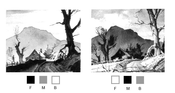
Let's use the three major values dark - light - and middle and work with them from now on to put together small thumbnail sketches.
I have below some cuts from Ted Kautzky's terrific book on watercolor 'Ways with Watercolor' still available.


"Keep It Simple Stupid"
No comments:
Post a Comment