Showing posts with label Henninger. Show all posts

Wednesday, April 10, 2013

The Art Center School circa 1960-1963

I recently posted a shout-out to one of my closest friends from the Art Center, Fred Pfeiffer, illustrator,whose career ended much too soon by his own hand.  At this age we are starting to loose our pals at an increasingly rapid rate.  Nostalgia took over while digging up as much as I could find from that period to provide some  back story to a dedicated site of his work FredPfeifferArtist.blogspot.com by two really avid fans Courtney Rodgers and Scotty Phillips. 
I thought it might be of interest to some still around as well as to those younger to what it was like at the former building on West Third Street in Los Angeles.

A later photo of the buildings on West Third


Lorser Feitelson
Lorser taught painting  history and technique starting generally with a short lecture and then an open session for your own project.  He encouraged younger painters to copy master paintings for technical understanding


Harry Carmean - drawing and anatomy


An accomplished draftsman, Carmean emphasized careful analysis of the human form.  The texts were Bridgeman and Peck.  Live models were naturally posed for varying lengths of time.  Conte crayon and newsprint pads were generally exclusive materials for these classes.


Morgan Henninger - Advanced Illustration class
 Assignments were given out a week in advance and the crits lasted most of the session...
Do not ever be late...(Deadline of Death)
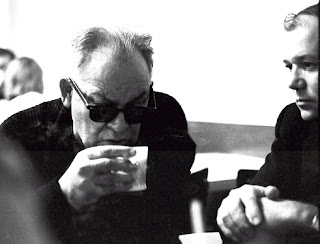
Kaminski and Ted Youngkin at coffee before morning classes
 Typical studio class


 Paul Sousa with I believe one of the Hubner twins
taken from an Art Center Catalog

preparing a board
 studio session during break


 Roommate John Demming and my truck at our shared studio on North Cahuenga
Check out the price of gas...1962


During our last year at the center we found a muddy lot on Franklin and thought up the idea of a rope pull between the Advertising Design Majors and the Illustration Majors.  The prints below were scanned in from photostats and have lost a great deal of detail.  Below are the art directors and I believe it was pretty much an exhaustive draw as we were all laughing so hard..


 The end of the day when the Blue visited the Brown

 Sandy and Timmy

Future Mad Men around 1963-64
If anyone out there has anything to contribute to this section I would love to hear from you...GL

Wednesday, September 9, 2009

Improve your drawing - Part 1

Here is a method to improve your drawing that covers two subjects...type construction and warm up scales.


The Warm Up..Who ever bothers to do this? Wrong..
No athlete ever goes into competition with out warming up – drawing is no different.
You are using muscle groups, finger dexterity and eye-hand coordination. Everyone who has ever studied music or played an instrument knows how 'sticky' your coordination is at the beginning of each session. After a few scales and arpeggios things begin to come together. I have adopted the same reasoning towards the quick improvement of your drawing ability. The exercises shown here are adaptations of those used in learning how to write, indicate type and drawing. There must be a gazillion books on drawing but not too many ever discuss practice strokes or the warm up. The practice strokes are analogous to the scales in music. Think about it...it will work if you are not in a hurry.


Here is a vintage cut from the Palmer Method lesson on repetitive practice for good handwriting.  It sounds nuts but if you work on learning to indicate a type face it will help your drawing considerably.
You get a two for one deal on this one as making notations in your journals will really have a neat look.


Learning how to indicate type (as it was called in the “good ol' days”) not only will give you an appreciation for the beauty and thought behind typeface design, it will help you in your note taking or expression in your journals or sketches.


Here is Adobe Caslon. I've shown examples of others as well and I suggest that you carefully compare the subtle differences between the faces – look at the lower case g's.


Mark out on a sheet of paper several groups of horizontal lines about 1 inch apart.  Set down a series of squares within the line in which you will copy each capital (upper case) letter. First draw the outer edge of the letter and then the inner edge. Just the outlines – do the entire alphabet – letters, numbers, and punctuation. This practice exercise will hone your ability to discern very subtle differences. Good for your drawing..!


 Now..sharpen a pencil to a chisel point and single stroke the serif forms so that you get a nice neat letter.


Use this reprint from an old Speedball pen handbook for the stroke sequences.(click to enlarge)

This is the start of learning a new and improved eye-hand skill with the added cool ability to charm your friends with an actual vintage effort in calligraphy.  My instructor in illustration at the Art Center School, Joe Henninger, wrote all of his letters with this nice neat hand.


This scratchboard illustration of Joseph Morgan Henninger was done by John McCormack for a beer ad in the '50's. (partial view)