Showing posts with label Sundblom. Show all posts

Wednesday, December 19, 2012

Improve Your Painting - plotting the lights and darks


One of the early lecture lessons in Lorser Feitelson's painting class at the Art Center School was analysing how the masters plotted out the lights and darks in their paintings.
Who better to look at than Caravaggio.  Here is breakdown of   'The Crucifix of St. Peter."


Desaturated to reveal the grey scale

Reduced to three values
 - light - middle - dark

 You can rotate your value study 180 or 90 degrees and flip back and forth to isolate your view to lose the subject matter and concentrate on value spotting.  Does it work in all directions?  One quick studio method is to hold up a small mirror to your eye and view your composition while in the process of painting or drawing..The errors usually leap right out at you. See other example at Sundblom.

Let's use the three major values dark - light - and middle and work with them from now on to put together small thumbnail sketches.

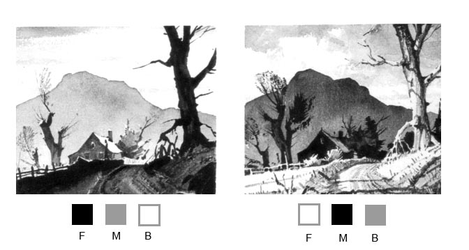
 I have below some cuts from Ted Kautzky's terrific book on watercolor 'Ways with Watercolor' still available.
 I added the value blocks Foreground, Middle, and Background with the appropriate value arrangement to help you design the same pictorial elements you see on site (or photographic reference) and create an interesting painting.

I hope that simplifies the constant struggle to make your work better and better - when in doubt -KISS
"Keep It Simple Stupid"

Wednesday, December 22, 2010

Sundblom and Santa - Haddon Sundblom's great Christmas gifts.


Nothing pulls at nostalgia during the Christmas holiday more than Haddon Sundblom's incredible Santa renderings for the Coca Cola Co.  For those painters and illustrators out there please really take a slow and careful look at the economy of style and brush-work that he employs on an iconic subject... This guy loved paint... lush and creamy with sure color..warm and cool... fire and ice.

Here are some more of Santa  that you may have missed by Sundblom...just click on the image to enlarge..


Merry Christmas to all and to all a good night.....

Tuesday, September 8, 2009

Haddon Sundblom - Home in America

 
Here is one of Sundblom's  Home in America beer ads about 1955.
His broad brush scrubs the light onto the fabric of the clothes and with a warm and cool light source.  Painters like Sargent, Zorn, Sorolla all expressed the form with rich strokes in the right place and careful delineation when needed like in the hands pictured below.

Lush and creamy -

Another of the Home in America series.
 
I have reduced the illustration into gray scale and rotated it 180 degrees to see the spotting of lights and darks for composition.  You can use this device with your own work to design the composition by first doing several small sketches (thumbnails) in black and white and then playing with them in Photoshop. Then go to a quarter size full color comp.

Haddon Sundblom - Painter - Illustrator

Best known for his Coca-Cola Santa's from the '50's Sundblom had a solid stroke - economical and bravura.
Sargent, Zorn, Sorolla are the lights on this path... more to come on this skilled painter-illustrator.


Tell me a story...


Below is one of the great Christmas Coke ads featuring Santa creamily painted with lush strokes.  click on image to enlarge


Follow the edges both lost and hard that add so much interest to this image.  Hands that are rendered with authority and fur that reads as fur all done with brush size and stroke.


Here is a closer view of how the warm and cool light so often used by the illustrators of the time makes the forms set against the background. The sharp edge contrasting with a soft edge which adds interest. While we're here take a good look at those hands...


In case you are curious as to who posed for this iconic brand label painted by Sundblom look at this photo of Haddon himself.

Next time we will look at some of his "Home in America" series.