Showing posts with label brush technique. Show all posts

Sunday, April 7, 2013

Thomas P. Quinn - Brushwork, and then some..great example of confident painting style

This gouache illustration for Field & Stream by Thomas Patrick Quinn Jr. dates from 1964...This is really as good as it can get for confident brushwork - lush and creamy style..Tom was a classmate at the Art Center School and brief roommate when we were all at the old Third Street studios.  Regrettably this style of illustration was slipping into oblivion with few exceptions ( John Berkey the most accomplished among them..) Magazine illustration was about to die almost completely in a few years and advertising was rapidly moving into photography snapping the ambition of fairly well trained graduating illustrators.

             Click to enlarge...!


   When the mid sixties hit (Mad Men plus) a lot of really good people dumped out..Cooper Studios
who had most of the top illustrators and most of the top business for all of the country went down.
For the next decade everyone scrambled to pick up what they could...paperbacks, spot drawings,
packaging..whatever.  Reps specialized and some did not always cut you the best deal...keeping major shares for themselves as you rarely saw the invoices.  I was working at J.W.Thompson as a sketch artist on the Ford account doing gouache 24 sheet (bill board) comps for the new Mustang and filling in on other major accounts.  What you see on 'Mad Men' was pretty much it at the time with the exception that I did not see a lot of in house drinking but everything else was common... the AD's and writers only hired good looking women who came from the Seven Sisters (Smith, Wellesley etc) as their secretaries. All others to the typing pool and media.  Assistant art directors were hired at about $60 a week and worked the bull pen for about 3 or 4 months and then be assigned to an AD.. no raise for a year and then if you were lucky got about a grand more per year.  I had a place on Prince Street in the village at the time and occasionally a married AD would ask for the keys to my place during lunch...That was never going to happen I am happy to say..there wasn't much they could do about it as the illustrators were needed for presentations.

Below is a small sketch by John Berkey who regrettably is no longer with us.


Wednesday, January 9, 2013

Improve Your Painting -The Value of the Small Sketch - part 2

Working small ... 3"x5" offers a lot of benefit to your development as an artist and thinker.
First, they get a lot done in a short time..They also usually wind up set aside and eventually rediscovered as nice little paintings - real examples of your true handwriting...

gouache study

gouache study
gouache study - Maryland

gouache study - Inlet Chester River - Maryland

oil study - Vermont

gouache study - Spain

Tuesday, December 18, 2012

Old school painting practice..copying the masters


Feitelson also advocated copying old masters after studying the composition and brushwork of old masters such as Frans Hals.
Frans Hals. Gypsy Girl. 1628-30. Oil on wood, 58 x 52 cm. Musée du Louvre, Paris.
Malle Babbe, c.1630. Oil on canvas, 75cm by 64cm. Staatliche Museen, Berlin


Below are the studies done in his class at the Art Center School.
(Close but no cigar) 
Valuable lessons in time management and brush technique.
I regret that I did not photograph these exercises with greater care.


Sunday, October 21, 2012

Fred Pfeiffer - Illustrator - 1940 -1995

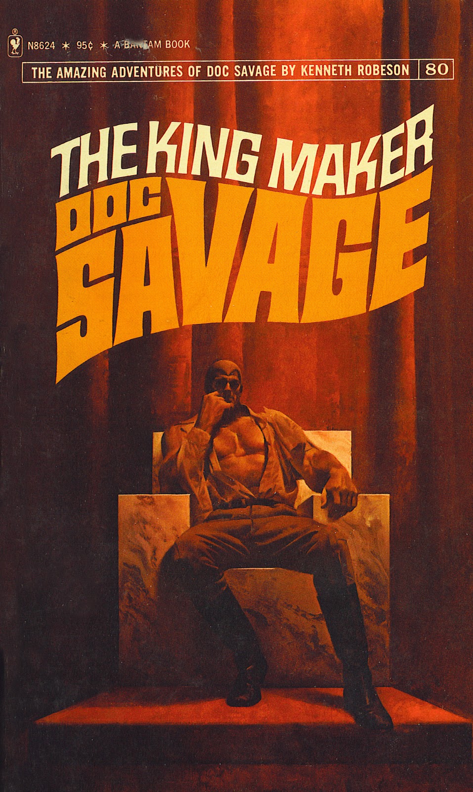
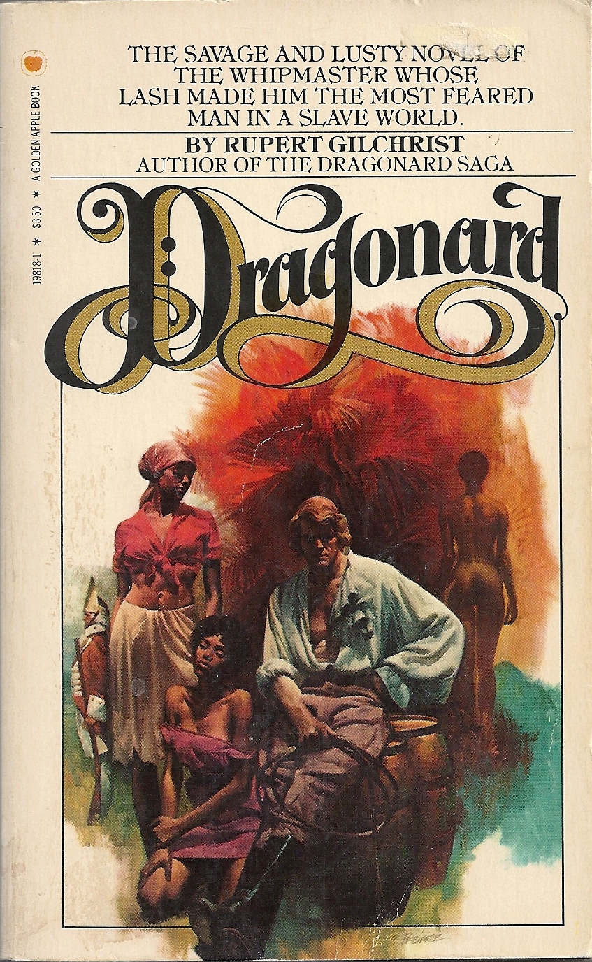
      Fred was a close friend all through our training at The Art Center School now known as the Art Center College of Design.  We remained close until his untimely passing in 1996. We shared a studio in NYC for several years where he executed beautiful covers for a number of top publishers notably Bantam and Dell.  He took over the Doc Savage covers from James Bama when Jimmy left for Wyoming and a terrific second career as a chronicler of western life.


You can view an enlarged view of each painting by clicking on the image.


I started a search for anything that I could find on the web and came across an excellent dedicated site http://fredpfeifferartist.blogspot.com/  by two true fans Courtney Rogers and Scotty Phillips.  I have been in contact recently with them and submitted whatever I had in my files re: correspondence, photos and anecdotes.  Fred had a great sense of humor and a very dry wit that could cut to the quick.  His life ended much too soon for all of us.

 I have included a few of his covers generously provided by Mr. Rogers in this post including this promo rendering from a publicity still which I animated to show the transition from the file shot photo to Fred's finished sample.


 This is Fred using an opaque projector to transfer and refine the model shot for the cover below.
If you look closely at the projected image you will see Steve Holland with his foot on a few books to replicate the rock below.

 Here is the finish from the model shot (superimposed on the above to show the garment refinement and character changes to suit the story line.)

Myself posing for the model shot


Saturday, July 28, 2012

End of Part One

I want to thank everyone who I have worked with successfully and also those who gave me a hard time... without which I never would have learned to cope with the ins and outs of the commercial art world.
I am closing off all of the outside work and just deal with a few new inside projects.  Looking forward to new posts that focus on specific tools and advice that I hope will advance your drawing and painting skills. Emphasis on short to the point tutorials (often opinionated) that aim to get you there with the least amount of wasted energy.... See you all in the next post.

Tuesday, February 14, 2012

Whitney Houston Portrait

Offering for the untimely death of Whitney Houston... This small portrait sketch was created for a promotional several years ago that never reached the light of day...


Tuesday, September 8, 2009

Haddon Sundblom - Home in America

 
Here is one of Sundblom's  Home in America beer ads about 1955.
His broad brush scrubs the light onto the fabric of the clothes and with a warm and cool light source.  Painters like Sargent, Zorn, Sorolla all expressed the form with rich strokes in the right place and careful delineation when needed like in the hands pictured below.

Lush and creamy -

Another of the Home in America series.
 
I have reduced the illustration into gray scale and rotated it 180 degrees to see the spotting of lights and darks for composition.  You can use this device with your own work to design the composition by first doing several small sketches (thumbnails) in black and white and then playing with them in Photoshop. Then go to a quarter size full color comp.

Haddon Sundblom - Painter - Illustrator

Best known for his Coca-Cola Santa's from the '50's Sundblom had a solid stroke - economical and bravura.
Sargent, Zorn, Sorolla are the lights on this path... more to come on this skilled painter-illustrator.


Tell me a story...


Below is one of the great Christmas Coke ads featuring Santa creamily painted with lush strokes.  click on image to enlarge


Follow the edges both lost and hard that add so much interest to this image.  Hands that are rendered with authority and fur that reads as fur all done with brush size and stroke.


Here is a closer view of how the warm and cool light so often used by the illustrators of the time makes the forms set against the background. The sharp edge contrasting with a soft edge which adds interest. While we're here take a good look at those hands...


In case you are curious as to who posed for this iconic brand label painted by Sundblom look at this photo of Haddon himself.

Next time we will look at some of his "Home in America" series.


Monday, September 7, 2009

John LaGatta at the Art Center


Anyone who has studied with John LaGatta has at least one story.
His method of instruction was strictly old school but wasn't that what you wanted at the time?
The drawing at the right is an example of his 'fine Italian hand' as he liked to call it... John was the first illustrator to crack a million dollars as his sensual drawings of the female form were much in demand by both story and fashion.  He spoke often of completing more that two drawings a day from hired models at $1800 per drawing... remember during the 20's and 30's taxes were no where to be seen.

His painting classes were always formed around a draped model lighted with  warm and cool sources for contrast on the form.  We were expected to have a prepared watercolor stretch with a gray-green half tone over the entire surface. A very careful drawing of the model in charcoal was done on tracing paper and transferred to the prepared stretch.  The medium was gouache.


Here is another example of his work exemplifying his beautiful rendering of  posterior views.  His fellow illustrators of the time affectionately referred to him as the ***man.
John had a very short fuse if he thought you were not following his instructions or "not getting it."  There was a student in one of our classes that John felt was not putting it together and ignoring him. During the break he noticed that the student had an ear piece with a lead to his breast pocket and assumed that he was hard of hearing and apologized. The student confessed that it was a radio and that he was listening to a ball game. LaGatta exploded. After the break we all had a little extra room to work in.

John would often join some of the students for coffee before classes and talk about anything and everything. He would roll a cigarette in wheat straw paper and get into some deep discussion or not depending on the day...
One morning I brought my Basset hound in to pose in one of the other classes as he was very accommodating... you could twist him into almost any position and he would remain there.  John just stared down at the dog for the longest time while rolling one of his yellow papered sigs and finally looked up at me and said "God must have been at the beach the day that this dog came into being designed. His head is too big for his body, his legs are too short, his ears are too long, his tail makes no sense..This is with out a doubt the ugliest thing I have ever seen. A design disaster."  "Sir" I replied, "You are defaming the dog I love"..


Here is a drawing by Laura Edwards of Sweetwater and myself done I believe with a sharpened popsicle stick, India ink and wash for one of the night classes.


The original Sweetwater circa '61

Sunday, September 6, 2009

John LaGatta Illustrator and Teacher


More of John LaGatta's drawing shows in the lovely hands and clinging folds of the models dress.

The drawing again describes so well the material and form.

John LaGatta