Showing posts with label portraits. Show all posts

Tuesday, November 11, 2014

Portrait of Dorian Gray - artwork analyis of the actual painting done by Audubon Tyler

Audubon Tyler taught at the Art Center School during the early 60's..I was fortunate to have him as an instructor between '60 to '63.
His history included work for the major film studios painting period portraits of stars and copies of master works that were to be destroyed in the narrative of film.  I have included what I could dig up on the web re: what he told me to fit the current entry.
Named after his grandfather James Audubon the naturalist, Tyler was a classically trained skilled portrait painter. He gave classes in head painting and drawing but offered much more in that he stressed the ability to really look at your subject and break down what you are seeing in terms of value placement... the simple largest shape of light and dark area. Basic painting...get it right the first time around..
He Spoke of working on the Picture of Dorian Gray which I have included on in this blog.  The credit for the portrait ( the before ) by the studio went to Henrique Medina, a Portuguese painter who often worked for the studio system..The story I heard is that both worked on the before painting as there is a transition between the very first shot of the portrait and one seen later as slightly showing a slightly hardened look.

I feel that the first painting seen in the film was the second retouched or 'sweetened'  original portrait done by Tyler as it has the feel of his other work as opposed to the soft look of Medina's work.

I offer examples broken into sectional  divisions that show how the painting was altered to sweeten the head.


charcoal sketch probably done by Tyler

Top is sweetened by Medina? Lower by Tyler- Check the difference in the eyes - the right eye is off a bit in the sweetened.


The second shot of the portrait in the film is just a cut to the head revealing the supposed hardening and does not have to be in sequence as scenes are generally shot out of sequence anyway.

Wednesday, January 9, 2013

Improve Your Painting -The Value of the Small Sketch - part 2

Working small ... 3"x5" offers a lot of benefit to your development as an artist and thinker.
First, they get a lot done in a short time..They also usually wind up set aside and eventually rediscovered as nice little paintings - real examples of your true handwriting...

gouache study

gouache study
gouache study - Maryland

gouache study - Inlet Chester River - Maryland

oil study - Vermont

gouache study - Spain

Tuesday, January 8, 2013

Improve your darwing and painting - the value of the small sketch

I can't stress enough the value of working up a small sketch (thumbnail size 1.5 inch by 2 inch or more) in order to develop better paintings... even when you are working from life or outdoors Plein Air style.
Working small freely enables you to think about the very basic composition re: lights and darks, shapes and placement of major forms.  That is what was taught 'Old School'. Just using a 2B pencil or simple black wash you build a visual fluidity and eventually a rapid understanding of exactly what you are looking at.
Somebody said once "The sketch promises everything and delivers nothing "--- not so fast - It delivers plenty.

Here are a few small thumbnails by Mucha done on toned paper with a little pastel for some of his murals
These were done as background studies for a sci fi TV film proposal for a Hasbro toy


The next step is to bring up your idea to a more detailed small painting -about 3" x 6" - to work out the color and discover how much you don't know about your subject...i.e. more studies..definitely Old School


Friday, December 7, 2012

The 8 best ways to improve your drawing


There must be a gazillion books and blogs regarding drawing but this series of posts is going to try to pull together and boil down the key approaches towards improving your drawing.
  1. Surround yourself with really good examples of great drawing.   
  2. When you look at your subject ask yourself "what is it the most?"
  3. Establish a vertical line (plumb line) mentally or even visually next to the subject.
  4. Find and fix in your mind the negative space or spaces that exist surrounding your subject.
  5. Understand what you are looking at...Think about the subject in the round or cross-section.
  6. Use your line or mark to express what you see..thick and thin line - straight and curved.
  7. Look for the opposite surface visible from the surface you are beginning to render with your line and consider that your new line will amplify the total form. 
  8. Follow the form surface with the shadow lines or texture.
The following books are highly recommended and cover all of the above in great detail..

The Vilppu Drawing Manual...(Excellent start and Art Center Graduate)
Bridgeman's Complete Guide to Drawing from Life


Loomis pen and ink

Oberhardt

Mucha


Paul Kley - pen and ink

Kollwitz


Mucha

Monday, October 22, 2012

War Draw - Ivor Hele - Aussie Artist 1912 - 1993


self portraits


Ivor Hele is one of those great draftsman that you probably never heard of...An Aussie that served in the war and chronicled daily drudge.. He was also enormously prolific and completed more commissioned works than any other artist in the history of Australian art. His front-line responses to war, sketched and painted for the Australian War Memorial, the portraits that won him the Archibald prize an astonishing five times during the 1950s, his exuberant nudes (Ivor and his wife swam nude at Maslins beach long before it was fashionable or legal to do so) and his magnificent landscapes of that rugged coastline south of Adelaide - where he lived as a recluse - combine to make up a prodigious body of work.
Read more about Ivor Hele here.


red crayon on toned paper


Sunday, October 21, 2012

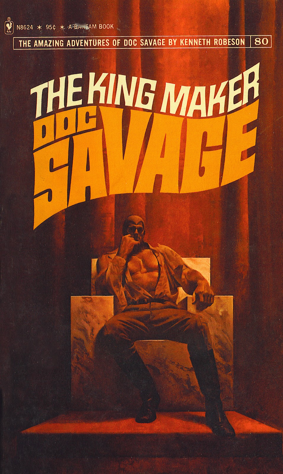
Fred Pfeiffer - Illustrator - 1940 -1995

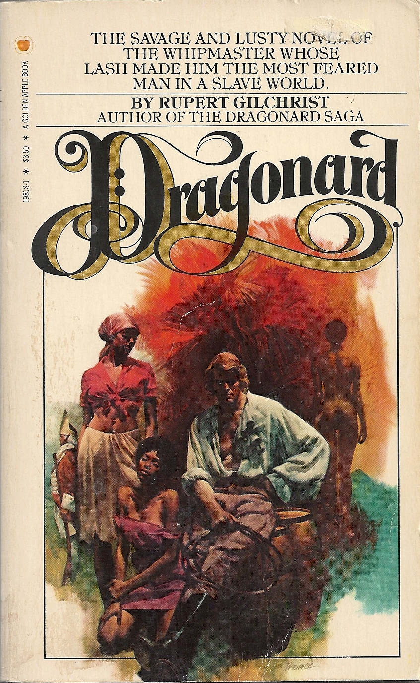
      Fred was a close friend all through our training at The Art Center School now known as the Art Center College of Design.  We remained close until his untimely passing in 1996. We shared a studio in NYC for several years where he executed beautiful covers for a number of top publishers notably Bantam and Dell.  He took over the Doc Savage covers from James Bama when Jimmy left for Wyoming and a terrific second career as a chronicler of western life.


You can view an enlarged view of each painting by clicking on the image.


I started a search for anything that I could find on the web and came across an excellent dedicated site http://fredpfeifferartist.blogspot.com/  by two true fans Courtney Rogers and Scotty Phillips.  I have been in contact recently with them and submitted whatever I had in my files re: correspondence, photos and anecdotes.  Fred had a great sense of humor and a very dry wit that could cut to the quick.  His life ended much too soon for all of us.

 I have included a few of his covers generously provided by Mr. Rogers in this post including this promo rendering from a publicity still which I animated to show the transition from the file shot photo to Fred's finished sample.


 This is Fred using an opaque projector to transfer and refine the model shot for the cover below.
If you look closely at the projected image you will see Steve Holland with his foot on a few books to replicate the rock below.

 Here is the finish from the model shot (superimposed on the above to show the garment refinement and character changes to suit the story line.)

Myself posing for the model shot


Tuesday, February 14, 2012

Whitney Houston Portrait

Offering for the untimely death of Whitney Houston... This small portrait sketch was created for a promotional several years ago that never reached the light of day...