Showing posts with label studio tips. Show all posts

Tuesday, November 11, 2014

Portrait of Dorian Gray - artwork analyis of the actual painting done by Audubon Tyler

Audubon Tyler taught at the Art Center School during the early 60's..I was fortunate to have him as an instructor between '60 to '63.
His history included work for the major film studios painting period portraits of stars and copies of master works that were to be destroyed in the narrative of film.  I have included what I could dig up on the web re: what he told me to fit the current entry.
Named after his grandfather James Audubon the naturalist, Tyler was a classically trained skilled portrait painter. He gave classes in head painting and drawing but offered much more in that he stressed the ability to really look at your subject and break down what you are seeing in terms of value placement... the simple largest shape of light and dark area. Basic painting...get it right the first time around..
He Spoke of working on the Picture of Dorian Gray which I have included on in this blog.  The credit for the portrait ( the before ) by the studio went to Henrique Medina, a Portuguese painter who often worked for the studio system..The story I heard is that both worked on the before painting as there is a transition between the very first shot of the portrait and one seen later as slightly showing a slightly hardened look.

I feel that the first painting seen in the film was the second retouched or 'sweetened'  original portrait done by Tyler as it has the feel of his other work as opposed to the soft look of Medina's work.

I offer examples broken into sectional  divisions that show how the painting was altered to sweeten the head.


charcoal sketch probably done by Tyler

Top is sweetened by Medina? Lower by Tyler- Check the difference in the eyes - the right eye is off a bit in the sweetened.


The second shot of the portrait in the film is just a cut to the head revealing the supposed hardening and does not have to be in sequence as scenes are generally shot out of sequence anyway.

Wednesday, April 10, 2013

The Art Center School circa 1960-1963

I recently posted a shout-out to one of my closest friends from the Art Center, Fred Pfeiffer, illustrator,whose career ended much too soon by his own hand.  At this age we are starting to loose our pals at an increasingly rapid rate.  Nostalgia took over while digging up as much as I could find from that period to provide some  back story to a dedicated site of his work FredPfeifferArtist.blogspot.com by two really avid fans Courtney Rodgers and Scotty Phillips. 
I thought it might be of interest to some still around as well as to those younger to what it was like at the former building on West Third Street in Los Angeles.

A later photo of the buildings on West Third


Lorser Feitelson
Lorser taught painting  history and technique starting generally with a short lecture and then an open session for your own project.  He encouraged younger painters to copy master paintings for technical understanding


Harry Carmean - drawing and anatomy


An accomplished draftsman, Carmean emphasized careful analysis of the human form.  The texts were Bridgeman and Peck.  Live models were naturally posed for varying lengths of time.  Conte crayon and newsprint pads were generally exclusive materials for these classes.


Morgan Henninger - Advanced Illustration class
 Assignments were given out a week in advance and the crits lasted most of the session...
Do not ever be late...(Deadline of Death)
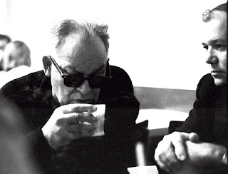
Kaminski and Ted Youngkin at coffee before morning classes
 Typical studio class


 Paul Sousa with I believe one of the Hubner twins
taken from an Art Center Catalog

preparing a board
 studio session during break


 Roommate John Demming and my truck at our shared studio on North Cahuenga
Check out the price of gas...1962


During our last year at the center we found a muddy lot on Franklin and thought up the idea of a rope pull between the Advertising Design Majors and the Illustration Majors.  The prints below were scanned in from photostats and have lost a great deal of detail.  Below are the art directors and I believe it was pretty much an exhaustive draw as we were all laughing so hard..


 The end of the day when the Blue visited the Brown

 Sandy and Timmy

Future Mad Men around 1963-64
If anyone out there has anything to contribute to this section I would love to hear from you...GL

Wednesday, January 9, 2013

Improve Your Painting -The Value of the Small Sketch - part 2

Working small ... 3"x5" offers a lot of benefit to your development as an artist and thinker.
First, they get a lot done in a short time..They also usually wind up set aside and eventually rediscovered as nice little paintings - real examples of your true handwriting...

gouache study

gouache study
gouache study - Maryland

gouache study - Inlet Chester River - Maryland

oil study - Vermont

gouache study - Spain

Tuesday, January 8, 2013

Improve your darwing and painting - the value of the small sketch

I can't stress enough the value of working up a small sketch (thumbnail size 1.5 inch by 2 inch or more) in order to develop better paintings... even when you are working from life or outdoors Plein Air style.
Working small freely enables you to think about the very basic composition re: lights and darks, shapes and placement of major forms.  That is what was taught 'Old School'. Just using a 2B pencil or simple black wash you build a visual fluidity and eventually a rapid understanding of exactly what you are looking at.
Somebody said once "The sketch promises everything and delivers nothing "--- not so fast - It delivers plenty.

Here are a few small thumbnails by Mucha done on toned paper with a little pastel for some of his murals
These were done as background studies for a sci fi TV film proposal for a Hasbro toy


The next step is to bring up your idea to a more detailed small painting -about 3" x 6" - to work out the color and discover how much you don't know about your subject...i.e. more studies..definitely Old School


Wednesday, December 19, 2012

Improve Your Painting - plotting the lights and darks


One of the early lecture lessons in Lorser Feitelson's painting class at the Art Center School was analysing how the masters plotted out the lights and darks in their paintings.
Who better to look at than Caravaggio.  Here is breakdown of   'The Crucifix of St. Peter."


Desaturated to reveal the grey scale

Reduced to three values
 - light - middle - dark

 You can rotate your value study 180 or 90 degrees and flip back and forth to isolate your view to lose the subject matter and concentrate on value spotting.  Does it work in all directions?  One quick studio method is to hold up a small mirror to your eye and view your composition while in the process of painting or drawing..The errors usually leap right out at you. See other example at Sundblom.

Let's use the three major values dark - light - and middle and work with them from now on to put together small thumbnail sketches.

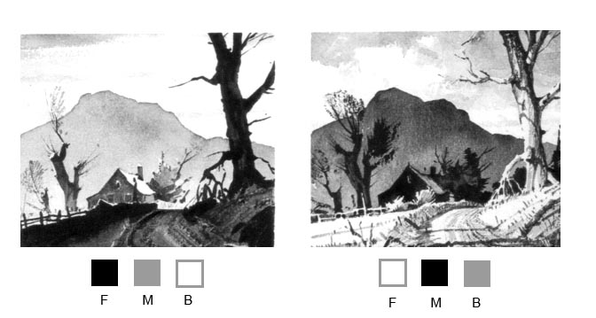
 I have below some cuts from Ted Kautzky's terrific book on watercolor 'Ways with Watercolor' still available.
 I added the value blocks Foreground, Middle, and Background with the appropriate value arrangement to help you design the same pictorial elements you see on site (or photographic reference) and create an interesting painting.

I hope that simplifies the constant struggle to make your work better and better - when in doubt -KISS
"Keep It Simple Stupid"

Tuesday, December 18, 2012

Old school painting practice..copying the masters


Feitelson also advocated copying old masters after studying the composition and brushwork of old masters such as Frans Hals.
Frans Hals. Gypsy Girl. 1628-30. Oil on wood, 58 x 52 cm. Musée du Louvre, Paris.
Malle Babbe, c.1630. Oil on canvas, 75cm by 64cm. Staatliche Museen, Berlin


Below are the studies done in his class at the Art Center School.
(Close but no cigar) 
Valuable lessons in time management and brush technique.
I regret that I did not photograph these exercises with greater care.


Tuesday, December 11, 2012

DIY Adjustable Drawing Table, quick and cheap!

Here is a simple and inexpensive way to get up and running in your studio space with a few simple tools and cheap parts...3/4" PVC pipe, 2 hinges, a few feet of thin chain and some scrap lumber.
The pics are self explanatory.  I'm sure you can do work-a-rounds for the hardware and use what ever works for you..

This drawing table can accommodate larger drawing pads, canvases, your picture reference, whatever and is very adjustable re: work angle.

You can fold this unit up and store it in a tight space and best of all it is cheap to make.

IKEA sells a table top (AMON) in white for under $6 and legs for about $15... You can buy one or two tops if you want a self supported separate table. 


Make sure that you dry fit the PVC first to get it square...I suggest that you leave it dry for while as you may want to change a few things..The legs as shown are about 10" (not including the elbows or rubber tips)
You can vary the dimensions to suit whatever you are able to come up with re: your current workspace table


The tops are apparently made in a mold with wood stiffeners in each corner to screw the legs into...you need to stay in this reinforced areas for your hinge attachment or your screws will pull out.  You can paint the underside of your board and wood base if you find the bare wood unsightly..

Saturday, July 28, 2012

End of Part One

I want to thank everyone who I have worked with successfully and also those who gave me a hard time... without which I never would have learned to cope with the ins and outs of the commercial art world.
I am closing off all of the outside work and just deal with a few new inside projects.  Looking forward to new posts that focus on specific tools and advice that I hope will advance your drawing and painting skills. Emphasis on short to the point tutorials (often opinionated) that aim to get you there with the least amount of wasted energy.... See you all in the next post.

Friday, May 13, 2011

DIY lighting stage for photo and painting setups


Here is a simple way to put up a very flexible portable stage you can use with inexpensive clamp lights.
Ordinary PVC plumbing pipe, shower rings, clothes pins, rubber crutch tips, clamp lights and white Foam Core are the basic components of this setup.   The only tools needed are a hacksaw and a miter box (optional).

I have opted out of using PVC cement as I can easily disassemble it for storage... You can however glue some of the sub-sections permanently that will store flat along with the background boards of Foam Core.
Foam Core is available in craft stores in  medium gray and black as well  so you can quickly set up the sides and back for different backgrounds.  Various colored papers in rolls or sheets can add to the mix.  By rigging up simple colored filters using colored CD cases or clear cases with stage gels set over homemade stage lights you have a variety of effects at your command.  Add an inexpensive white translucent shower curtain cut to fit the sides, top and front and you have a very practical light box for photographing small items with soft, even light.


Simple clothes-pin and shower curtain ring makes a quick release for the backgrounds.


This simple set up is inexpensive and quick to assemble - use your creative juices to add to the mix..
See you in the next blog. GL